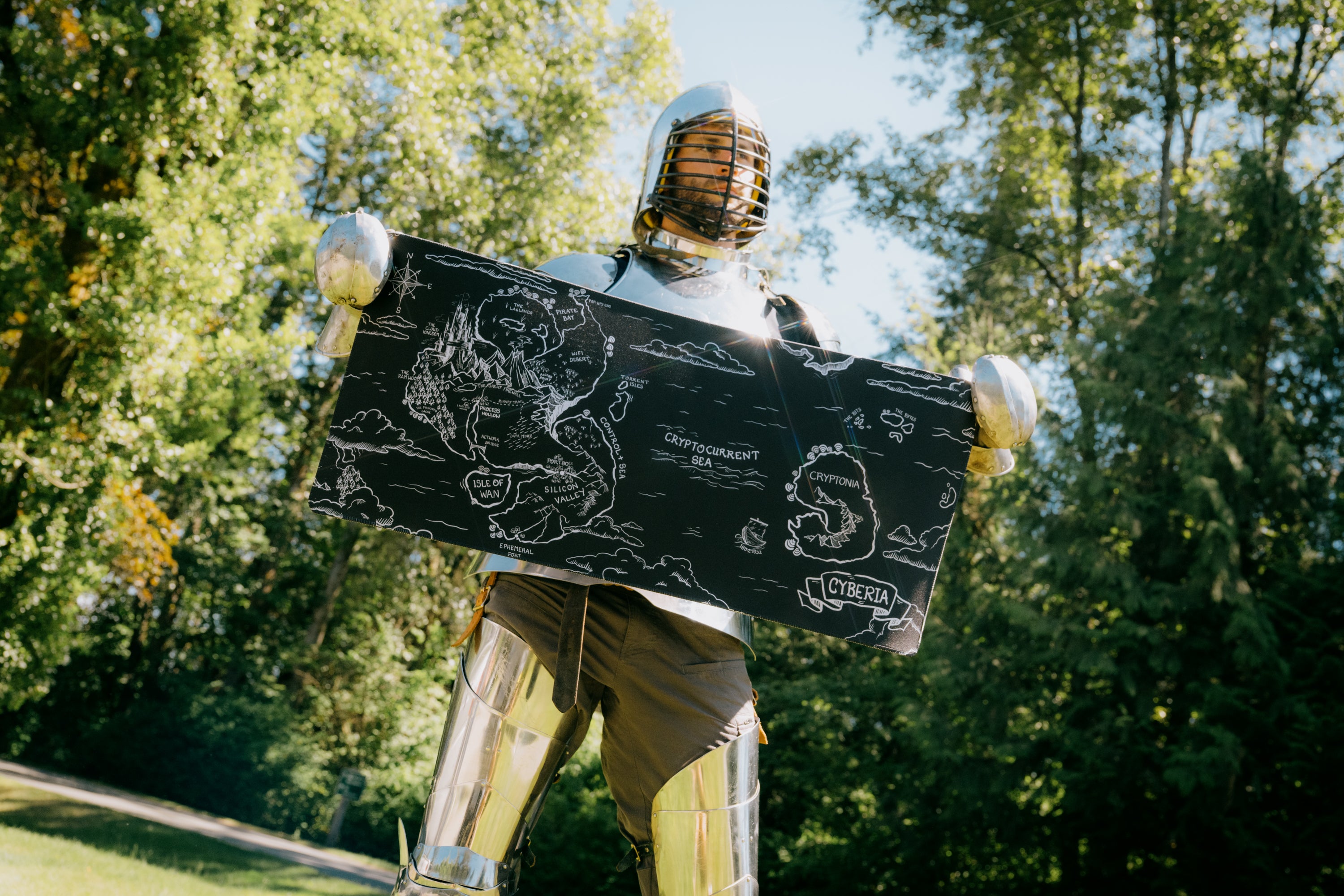
Colors… there’s a lot of them. And it turns out they’re one of the most important parts of basically every aspect of our business - lighting, editing, benchmarking, product development, graphic design, and of course fashion design.
I spend more time than I ever thought I would discussing whether this grey works better than that grey, or whether the gloss on a tag shines just the way that we expected it to. And at the end of the day, it’s a very worthwhile pursuit.
But of course, when it comes to advice on colors, I only trust the absolute best. You may know her as Agent Cashnickel, or “That ShortCircuit host with the infectious laugh,” but I know her as Sarah Butt, an absolute ace in color and graphics. Here’s some insight from Sarah on why wehaven’tchosen to work with some of the colors we’ve come across in our product development journey.
Sarah Butt Graphic Designer & Color Aficionado
Color is always one of the most important elements of my projects - especially something like our Beanie collection.
As fun as picking colors can be, it can also be a bit tedious. We have to make sure that every color is versatile and can be worn with anything and by anyone, and we always want the colors in a set to complement each other as a collection.
Our process involves a lot of ordering samples, waiting, getting approvals, making adjustments, and waiting once again. It takes a while to get to the final set you see today in our store.
But it’s pretty obvious why we’ve picked the ones you see in the store today… they’re versatile and were our top picks, not much more to say there. So here’s some insight on why we didn’t choose to go into production with 4 other colors that we chose in our sampling process.
PANTONE 481 C / SWATCH 194
Neutral tones are really popular right now but we had some concerns that this specific camel color didn’t complement a lot of skin tones very well. We try our best to make sure our products are as inclusive as possible, so this is always a significant consideration for us in the process, and this one just didn’t pass the test.
PANTONE 1655 C / SWATCH 024
This one was intended to match the LTT brand color (just in case you want to shout your support from the rooftops!). When we received the sample it was not quite comparable to the color we had requested... it was much more of a pink salmon than the red-orange we were expecting. This was definitely a case of the wool / acrylic blend not being capable of replicating the color that we saw on the 100% acrylic swatch, and unfortunately that’s just something that we often can’t control.
PANTONE 2372 C / SWATCH 068
We loved this purple and brown leather tag combo, but it was an unfortunate victim of circumstance. We had already decided that the 4 new colors we chose were more likely to appeal to a wider variety of people, so purple was put on the chopping block.
What’s interesting is that this might have actually been a mistake on our part… the purple lanyards are INCREDIBLY popular, so it’s clear that there’s a big demand for it in the audience. You might see this one in a future drop :)
PANTONE 4101 C / SWATCH 194
Just like that LED strip you bought on Aliexpress, this color just didn’t live up to our expectations. We had already picked the burgundy, and this was a close comparison, just… a bit uglier. When we saw all of our samples together, it was an obvious decision - burgundy was the way to go and this off-brown ginger got thrown into the “freebie” pile here at the office.
This color is great on other garments but it just didn’t work out here with the beanies.
Thanks Sarah!
And if you want to get your hands on some colors that Sarah did pick, you can grab a beanie OR one (or 6?) of our brand new ShortCircuit “Banana for Scale” plushies, available in 6 awesome colors. You can pick up one for $9.99, or a pack of 6 of just over $40.
Thanks for checking in this week, and be on the lookout for some other awesome releases as we close out 2021


